A dining room can contain all the right pieces and still feel slightly unfinished. The table fits, the chairs are practical and the lighting works, yet the space lacks the polished look you saved on Pinterest. The usual reaction is to start shopping for expensive furniture, but price is rarely the real issue.
Luxurious rooms often share something more achievable: intention. Their colours relate to one another, the lighting creates atmosphere and each object appears to have earned its place. Nothing feels accidental, even when the room includes affordable finds.
The good news is you don’t need a full renovation or an extravagant budget. A few thoughtful changes can make an ordinary dining area feel considered, stylish and ready for everything from a quiet breakfast to a dressed-up dinner.
Start with the pieces that shape the room
The first way to elevate a dining space is to give it one clear focal point. In most rooms, that should be the dining table or the seating around it. If every item competes for attention, the result can feel busy rather than luxurious. Choose one feature to lead, then allow the remaining pieces to support it.
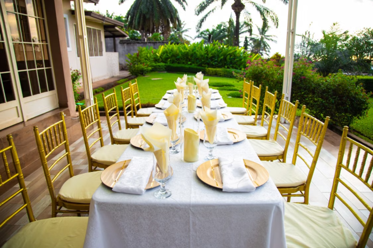
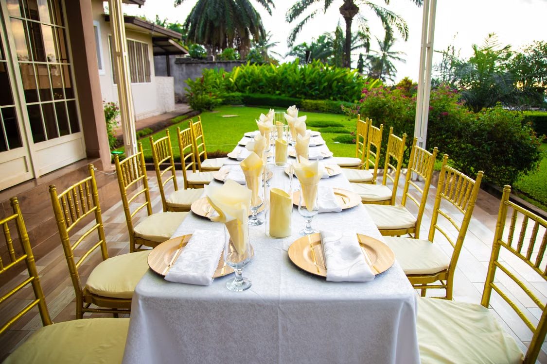
Statement seating is particularly effective because chairs repeat around the table, creating an immediate sense of rhythm. Chiavari chairs can solve the problem of a dining area that feels too plain without adding visual bulk. Their slim frames and distinctive backs introduce structure and elegance while keeping sightlines open. This is especially useful in smaller rooms, where heavy upholstered seating can make the table area appear crowded.
The second upgrade is to create contrast between the table and chairs instead of buying a perfectly matched set. A dark table paired with pale or transparent seating can feel lighter and more contemporary. A simple wooden table can gain a more glamorous character beside black, white or gold-toned chairs. Even a modest table looks more deliberate when the seating has a recognisable silhouette.
Before choosing a finish, look at the hardware already present in the room. Cabinet handles, curtain poles and light fittings offer useful clues. The finishes do not need to match exactly, but they should feel related. Repeating black, warm brass or soft silver in two or three places helps the room look connected without making it overly coordinated.
Use lighting and scale like a stylist
The third way to make a dining area look more expensive is to fix the lighting. A bright ceiling bulb may be practical, but it can flatten colours and make even beautiful furniture feel ordinary. A pendant positioned above the table creates a visual centre and separates the dining zone from the rest of the room, which is particularly helpful in an open-plan home.
Scale matters more than many people realise. A tiny pendant above a large table can look apologetic, while an oversized fitting gives the room confidence. As a general visual guide, the light should relate to the width of the table rather than the size of the entire room. For a long rectangular table, two smaller pendants can look more balanced than one fitting placed in the middle.
Warm bulbs usually create a softer atmosphere for dining than cool white light. If possible, add a dimmer so the same space works for different moments. Brighter light suits breakfast or working at the table, while a lower setting makes dinner feel more intimate. Candles or a small rechargeable table lamp can add another layer without requiring electrical work.
The fourth trick is to hang curtains higher and wider than the window frame. Short curtains fitted tightly around a window can visually shrink the wall. Full-length fabric, mounted closer to the ceiling and extending beyond the sides of the window, makes the room appear taller and the glazing more generous. Linen-effect or softly textured curtains can achieve this without the price of heavy bespoke drapery.
Keep the hem neat and intentional. Curtains can just touch the floor or pool slightly if the fabric suits a relaxed look. An awkward gap above the floor tends to break the illusion. If privacy is important, sheer panels behind the main curtains provide coverage while still allowing daylight into the space.
Make the details look collected, not cluttered
The fifth upgrade is to introduce texture through a few carefully chosen materials. Expensive-looking interiors rarely rely on colour alone. They combine surfaces that respond differently to light, such as smooth glass, woven fabric, polished metal, natural wood and matt ceramics. The contrast gives the room depth, even when the palette is neutral.
A table runner, upholstered seat pads or a large rug can soften hard furniture and improve the acoustics of the room. The rug should be large enough for chairs to remain on it when pulled away from the table. A rug that only sits beneath the table legs can look undersized and may catch beneath the chairs. In a busy household, a flat-woven or low-pile option is usually easier to clean and move across.
The sixth way is to style the table with restraint. Covering every surface with ornaments often makes a room feel smaller. Instead, build one simple arrangement using objects of different heights. A low bowl, a vase with a few branches and two candleholders can create more impact than a collection of unrelated accessories.
Remember that the dining table still has a job to do. Keep the centrepiece narrow enough for people to see one another and light enough to move when extra serving dishes arrive. Odd-numbered groups, particularly sets of three, often feel natural because they avoid rigid symmetry. For a lived-in finish, include something useful, such as a beautiful water carafe or a bowl of fresh fruit, rather than styling the table entirely with decorative objects.
The surrounding surfaces deserve the same restraint. On a sideboard, leave some space around each group of objects. Negative space is not wasted space. It allows the pieces you have chosen to stand out and makes the arrangement feel calmer.
The expensive look is really considered
A polished dining room is not defined by how much everything costs. It comes from proportion, repetition and a few confident choices. Give the room a focal point, choose seating with character, improve the lighting, correct the scale of the curtains, layer tactile materials and edit the accessories.
Start with the element that currently bothers you most. If the room feels flat, rethink the chairs or lighting. If it feels cramped, reduce visual clutter and choose slimmer shapes. If it feels cold, add warm light and fabric. You can explore the seating available from Seats and Beyond for inspiration, then build the rest of the space around the finish and silhouette that suit your home.
About the Author